


When looking to optimize sales for a Shopify store the focus should be on the buyers journey.
The place where a browser becomes a potential buyer is the product page. Everything on the page must be optimized to sell.
Designers & Developers vs Marketers
Many designers and developers create themes and layouts that just ‘look good’ and ‘works good’ but many times it just doesn’t ‘sell good’.
The fix to this is thinking what turns someone from a person who doesn’t know anything about your brand to someone who is feeling confident they want your product and they trust your brand and feel compelled to place an order today.
Shopper’s Perspective
To understand this think from the shopper’s perspective:
- They are seeing a lot of ads everywhere everyday, they are usually informed about the market, the prices, the shipping, how a website should work and look like, what’s the checkout process, what’s the delivery process, etc.
- They come to the website first time from your social media, google, or ads
- The page they see is usually going to be on their mobile phone and you’ll have around 15-30 seconds to grab their attention and convince them
- As we’re now in a developed market in 2024 and beyond, just good design or a low price is not enough, everything in the design and the presentation must be focused on conversion
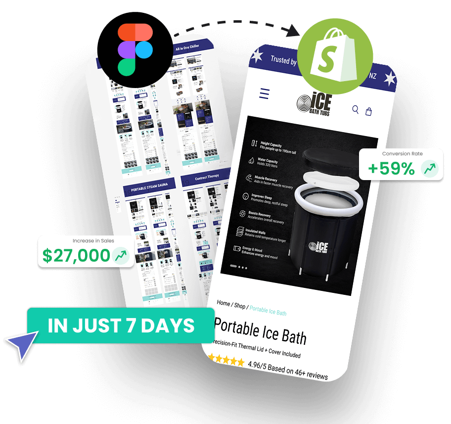
At EcomRolodex we create design prototypes that are optimized to sell first, not just present products like a restaurant menu.
Below are some transformations we did for existing brands, focusing on the buyer’s journey from the product page to the cart to checkout and what happens on the way on and off the website.

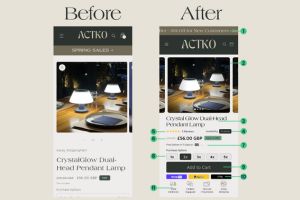
Product Page Optimization List
- Add a moving announcement bar – the majority of announcement bars are quickly ignored by online shoppers. The way to still get attention to a good offer on the top of your website is to animate the line so it moves a little bit. The more attention it gets the more likely you are to get your offer seen and taken
- Removing unnecessary elements and reducing whitespace to make room for important elements and Call-to-Action. In this case, spring sales is neither a good headline nor placed correctly on the screen.
- Removing by default vendor information shown by Shopify and adding the title in the middle of the screen
- Social proof in the form of reviews is one of the best sales tools you can have, that’s why it’s great to get as many reviews as possible and display them on the website. Your existing customers sell better than any message you will put on your website so make sure to display reviews prominently on the first screen near the title before the price. Reviews are best displayed with gold stars and an odd number, on tap it should scroll down to the reviews section.
- The badge in stock removes the objection of both the website being updated and the shipping being long. Even if you have long shipping, saying in stock tells the shopper that comparatively they will get this fast. Any extra assurance helps push someone to buy from you versus the other place. Imagine there are 2 websites, everything equal, just one says in stock, while the other says nothing, which one you’re more likely to buy from?
- The correct way to display price is as follows: First show the original price, second show the current price, then show the calculation of how much they are saving. This has the psychological effect of actually showing the value of the sale and how it’s a deal and it’s more likely to convince, since it’s simple to understand and it creates the anchor of showing that this product is actually more expensive. It’s best to pair this with a limited time offer, either on the product page or in the ads.
- Once someone is interested in buying the product, the most frequent question is “How long is the shipping?” or “When am I going to get this?”. That’s why you want to handle this as early as possible and make sure it’s seen. If you have fast shipping then display it highlighted above or below add to cart button.
- The easiest upsell you can do if you don’t have any data yet about how your people are buying is to show volume. The trick is to make it easy to just tap and choose. In the case of this brand we transformed the quantity selector from just -1 +1 to choose options. This makes your website work like a real sales person. If you were selling the product to someone interested, you’d probably offer to buy 2-3-4 and that’s exactly what the design we did offers.
- Displaying a Call to Action (CTA) prominently on the front screen of a website or app can significantly enhance user engagement and conversion rates. Studies indicate that CTAs placed above the fold tend to perform better, often leading to conversion rate increases of 100% or more. Businesses commonly conduct A/B testing to measure the effectiveness of different CTA variations, with clear CTAs like “Buy Now” or “Add to Cart” proving to be particularly impactful in driving sales on e-commerce platforms. While the exact percentage increase may vary depending on factors such as industry and audience, the general consensus is that prominently featuring CTAs on the front screen leads to higher user interaction and conversion rates.
- Showing familiar payment gateways can increase your conversion as some people prefer to only buy with Apple pay, or only with Paypal because of convenience and security. In some cases you can lose as much as 30% by not having these payment methods displayed as 90% of visitors make the decision to buy or not to buy on this screen.
- Displaying badges such as “Secure Transaction,” “Online Support,” “Fast Delivery,” and “Easy Returns” on the first screen of a website or app can confer numerous benefits. These badges provide immediate reassurance to users about the safety and reliability of their transactions, thereby increasing trust and reducing concerns about security. Additionally, the presence of “Online Support” badges signals to users that assistance is readily available if needed, enhancing their confidence in making purchases. “Fast Delivery” badges appeal to customers seeking convenience and prompt service, while “Easy Returns” badges alleviate fears about potential dissatisfaction with products, encouraging users to complete their purchases knowing they can easily return or exchange items if necessary. Overall, prominently displaying these badges on the first screen can enhance user experience, foster trust, and ultimately lead to higher conversion rates and customer satisfaction. The badges must not look like copy paste from other website, they need to look like they belogn to your branding and website.
If you want us to analyze your website and propose how you can sell more, send a request now →