Unpacking the Secrets of a 4% Conversion Rate: An Analysis of Bleame’s Shopify Store
The digital marketplace is teeming with competition. Standing out and achieving a stellar conversion rate can seem like an insurmountable task. But Bleame’s Shopify store, with its impressive 4% conversion rate, demonstrates that it’s very much possible. Let’s dissect what sets this store apart.
What is 4% conversion rate on Shopify?
It means out of every 100 people who visit your online store, only 4 decide to make a purchase. Or 40 out of every thousand.
According to a survey listed on Shopify, anything more than 3.2% would put you in the best 20% of stores we benchmark for conversion rate, and more than 4.8% would put you in the best 10%.
1. Custom Shopify Product Page Design: Standing Out in a Crowd
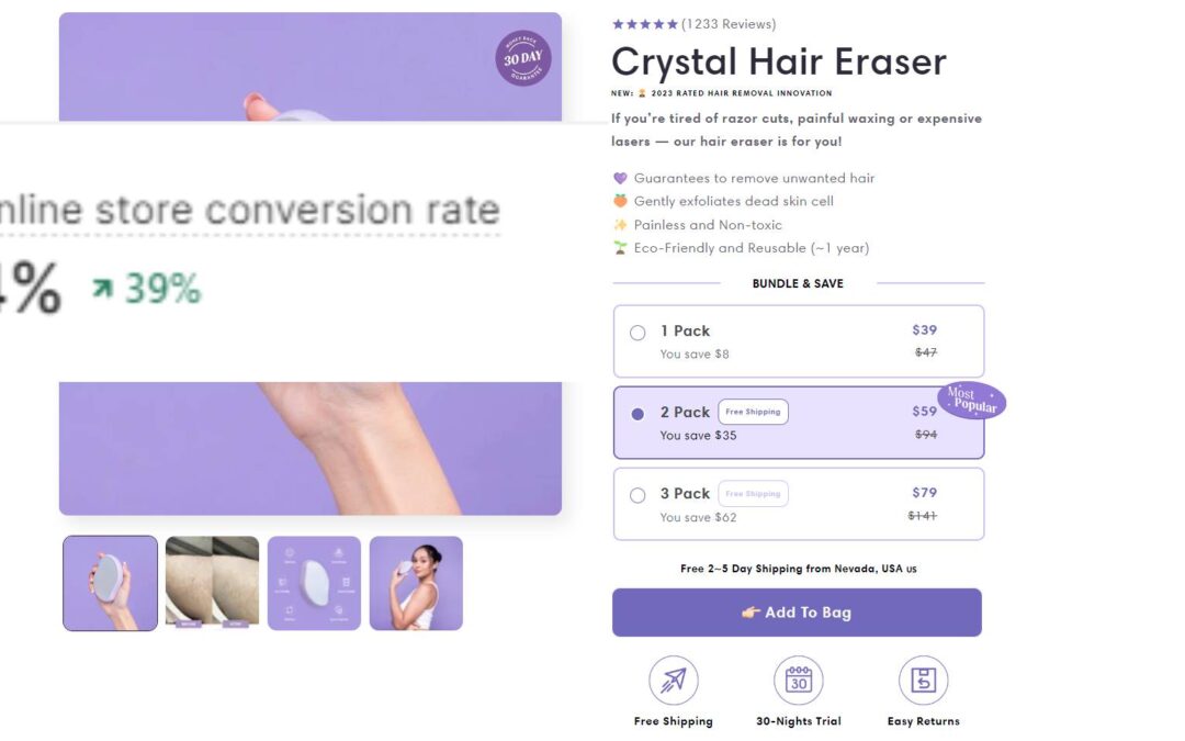
Bleame’s product page isn’t an off-the-shelf theme; it’s a meticulously crafted custom design. While many elements echo the Epic Theme, the majority are non-standard. To achieve extraordinary results like Bleame’s, stores can’t rely solely on standard practices and generic themes. Especially when many theme developers may not fully grasp the intricacies of conversion rate optimization.
2. Non-Standard Shopify Theme Elements: The Extra Mile
Bleame’s page goes beyond the norm. Every element is optimized for sales:
- Announcement Bar: Featuring the ever-effective BOGO (Buy One, Get One) offer.
- Shipping Bar: Offering free shipping and fostering trust with live purchase notifications.
- Imagery: Product images are not just static; they reiterate the offer, further solidifying the proposition. At EcomRolodex we also help with designing and creating better product images and videos.
- Reviews: They’ve employed an uneven number, a subtle strategy borrowed from Amazon, making reviews appear more organic and less curated.
- Upsells: Integrated seamlessly, they prompt customers to buy more than just a single item.
3. Learning from the Best: Borrowing from Amazon
Bleame’s product page borrows several strategies from the e-commerce giant, Amazon. From the four bullet points detailing product features to the repetitive emphasis on free shipping – a key aspect that Amazon has trained online shoppers to look for.
4. Trust and Credibility: Media Features
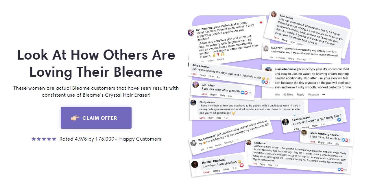
Brands often overlook the value of media features. Bleame’s mention of their media presence not only serves as a trust signal but also as a testament to their product’s credibility. You can get guaranteed media features at PressForWeb →
5. Detailed Descriptions: Overcoming Objections
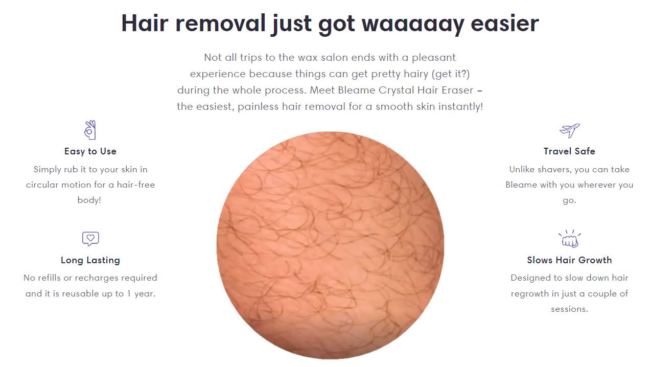
One of the hallmarks of an optimized product page is its ability to preemptively address potential customer objections. With a structured description, usage instructions, and multiple mentions of shipping information, Bleame ensures that customers have every piece of information they might seek, thereby reducing friction in the purchase process.
6. UGC (User Generated Content): The Power of Authenticity
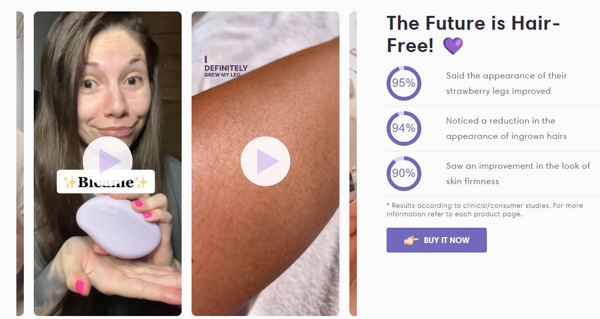
Bleame’s use of UGC, particularly videos that mimic real customers using their product, adds an authentic touch. This form of content not only enhances trust but also provides potential buyers with a tangible sense of the product’s effectiveness. Recommendation: To easily get a lot of UGC you can use Billo →
7. Emphasizing Benefits & Guarantees: Building Trust

From the ’30 nights trial’ to guarantees and multiple mentions of benefits, Bleame’s product page continually reassures visitors, reducing perceived risks and enhancing the likelihood of conversion.
8. FAQs: Addressing Concerns
Every high-converting landing page typically features a detailed FAQ section. By addressing common concerns and queries, this section further reduces purchase hesitations. This is also a great way to overcome potential objections and further sell the benefits of your product and brand just like in the example.
9. Repetition: Hammering in the USPs
Throughout the page, Bleame employs repetition for its unique selling points. Whether it’s the free shipping offer or the product benefits, this repetitive approach ensures these key points are ingrained in the visitor’s mind. The 3 benefits below increase conversion by lowering the perceived risk of purchase from a new brand:
✅Risk-free: 30-Nights/Days Trial
✅Free Shipping
✅Easy Returns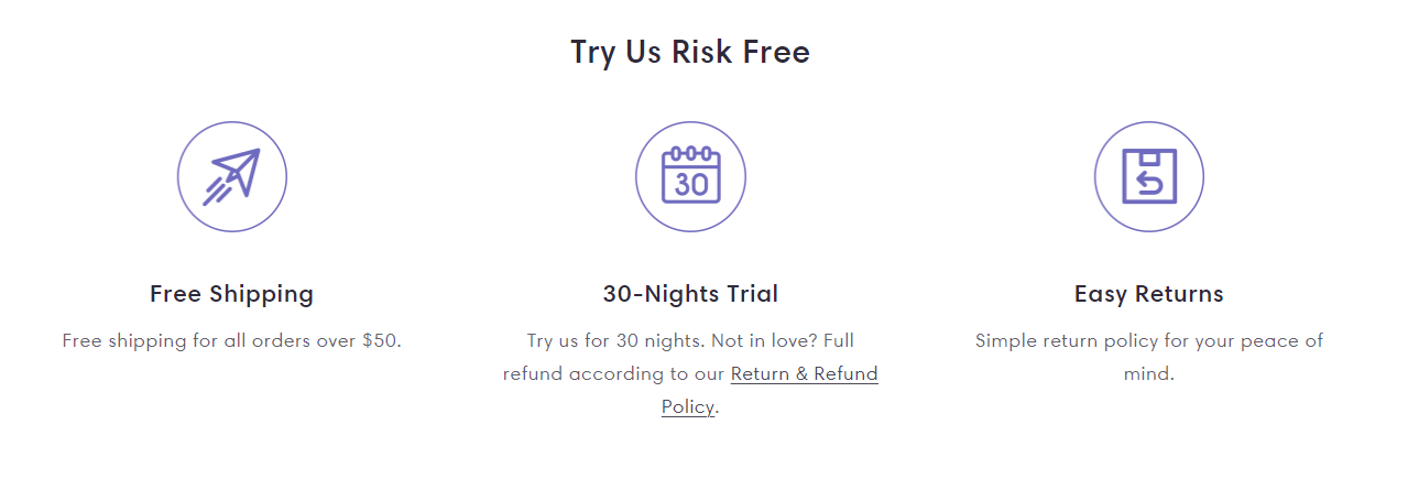
10. Sticky add to cart
To make it possible for the potential buyer to easily buy from any part of the screen while reading the description of the long page, Bleame added a sticky add to cart which looks like in the image below.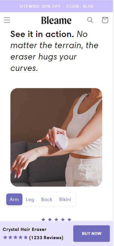
11. Upsells in Cart: Maximizing Revenue
Bleame’s cart experience is also optimized. With intuitive upsells and clear messaging, they guide customers towards larger order values. They also have a free shipping upsell, helping them boost Average Cart Value.
We have the free shipping threshold described here.

12. Showcase As Many Reviews as Possible
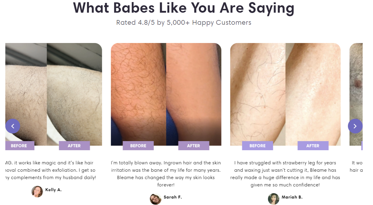
Bleame shows reviews through edited images, stars with thousands of reviews at the top, through UGC content, through before-after images, and through the dedicated “Leave a Review” section. This sets an example for brands that want to achieve record-breaking conversions.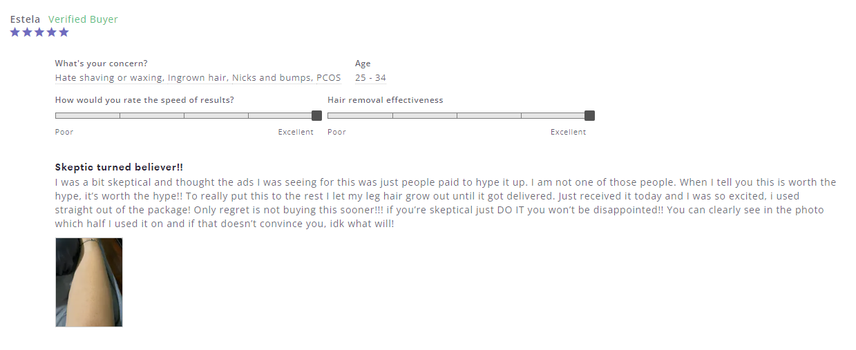
13. Using Gifs to Sell the Product
To answer the questions, “Is this easy to use?”, “Where can I use this?” and “How to use?”, Bleame came up with a genius gif section. This helps show that it’s a real product, used by real people, and it’s easy to use.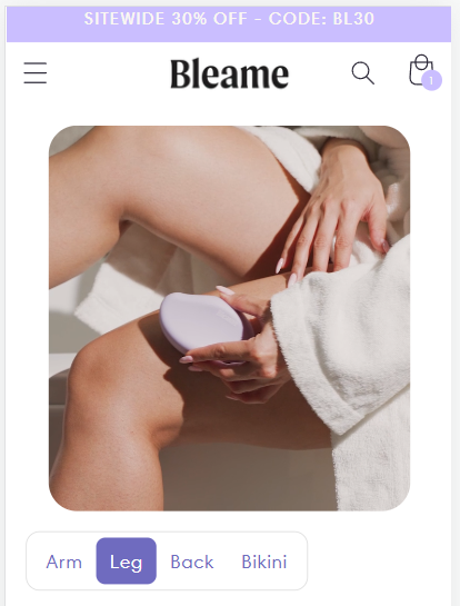
In Conclusion
Achieving a 4% conversion rate, like Bleame’s, requires meticulous planning, design, and strategic implementation. As demonstrated, it’s not just about driving traffic, but more importantly, about optimizing every element of your Shopify store to ensure that traffic converts.
If you want to get a high-converting product page designed in a few days and ready to run ads and scale your product, then check our custom page design service here →

By examining success stories like Bleame’s and implementing proven strategies, any Shopify store can elevate its conversion rate, driving sales and maximizing ROI. If you’re seeking similar results, consider leveraging the expertise of teams like EcomRolodex, who specialize in optimizing Shopify stores for peak performance.
If you’re looking for a Shopify Conversion Expert, get a free audit of your store →


